Client Overview
The client provides educational fitness service products that motivate and guide people to live healthier and happier lifestyles. They aim for women and children to break the chain of lifestyle diseases through their mobile app and products and develop habits around wellness and fitness.
Our Aim
Saffron Tech wanted to develop a robust mobile application for the client by keeping in mind the fitness trends, customers’ health needs, easy app useability, along client’s requirements. The basic idea was to create a unique app for workouts and fitness training and selling fitness products.
We wanted the UI to be simple with relevant pictures/videos taking a higher focus on the fitness needs of every individual that’s using the app.
Our Solution
We developed a Hybrid mobile application for the client that acted as a one-stop-shop for all its users to meet their fitness needs. The app was developed by maintaining the balance between users’ needs, business goals, and technological adaptations (.Net for development) to achieve the best results.
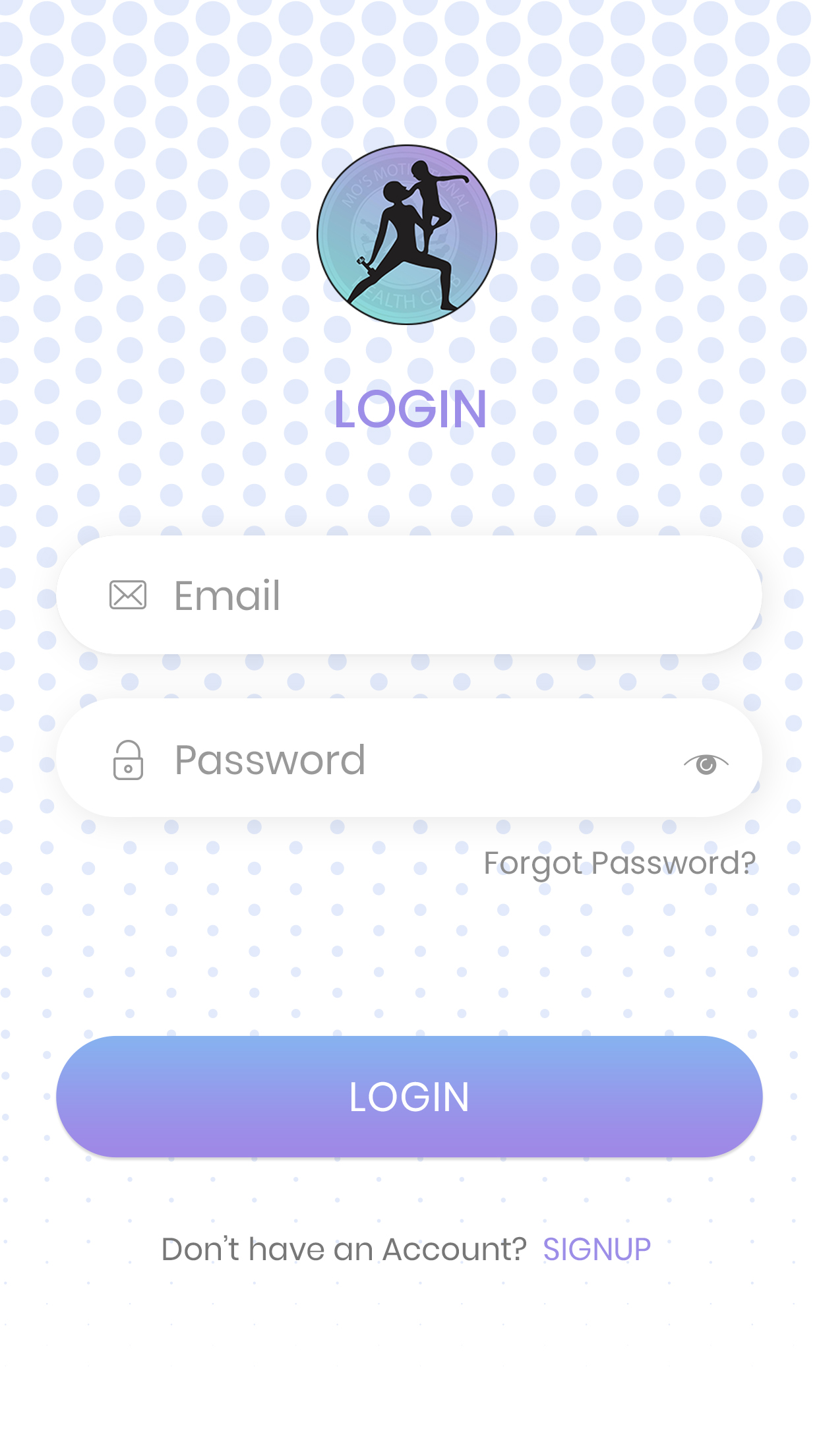
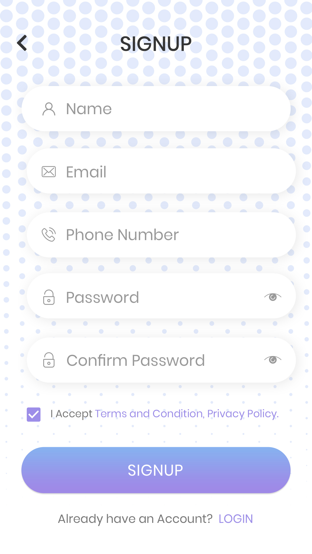
(Image: Log in and Sign Up screens of the app)
It is more like a family fitness program that contains workout tutorials, which are trackable and can be done by users wherever and whenever they want.
As for the users, we created a common dashboard that acted as a feed to introduce new workout sessions.
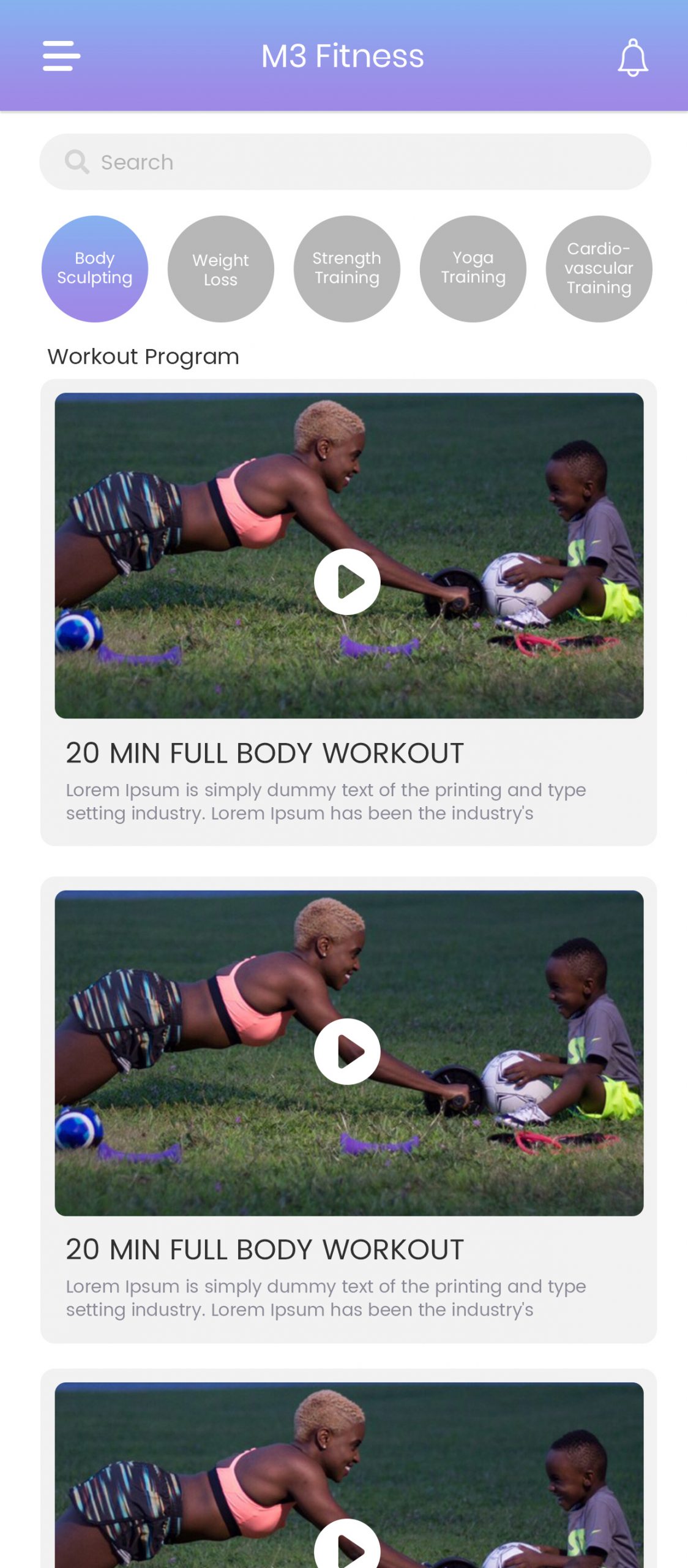
Although they are first required to create their profiles, choose their membership plans, and select their workout routines to take this forward.
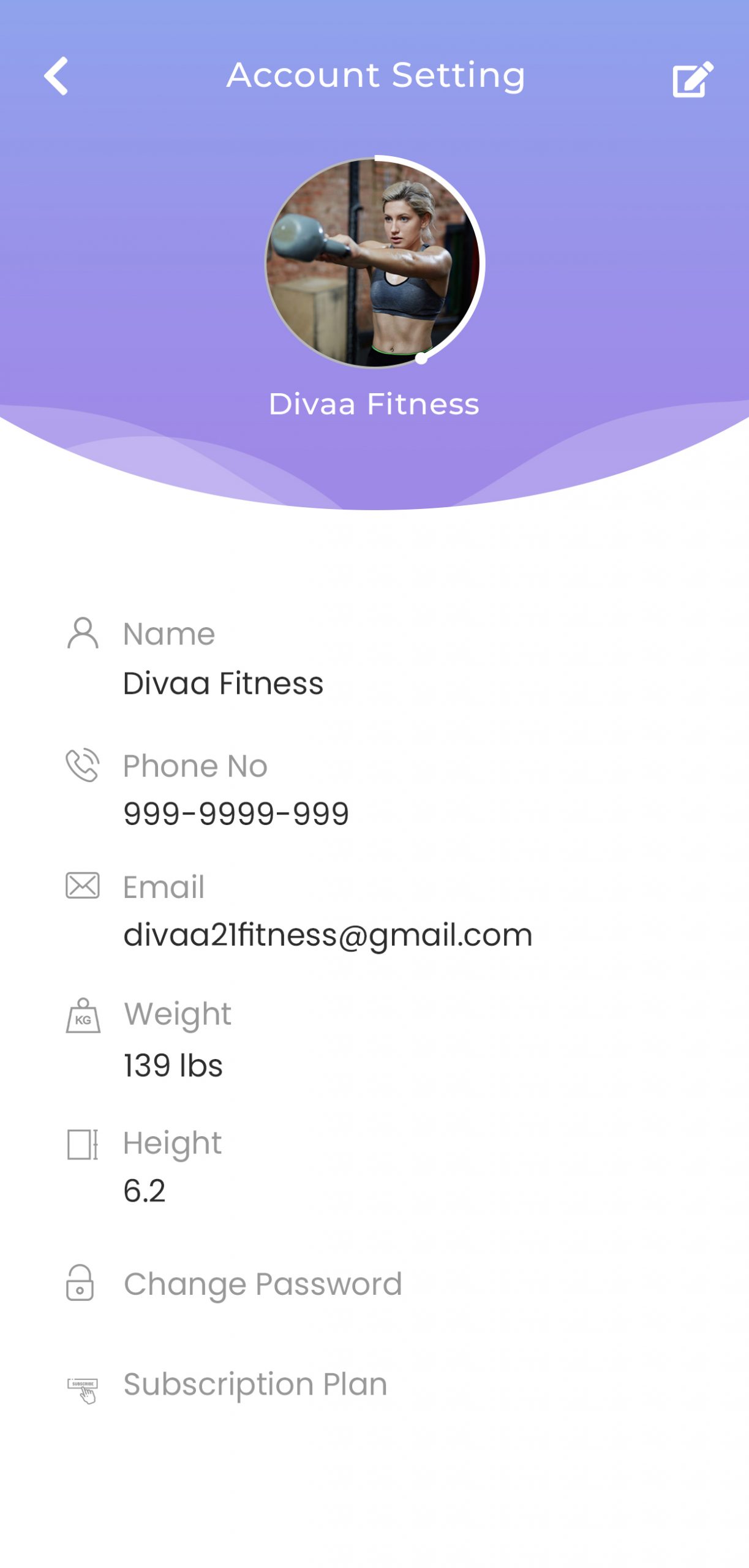
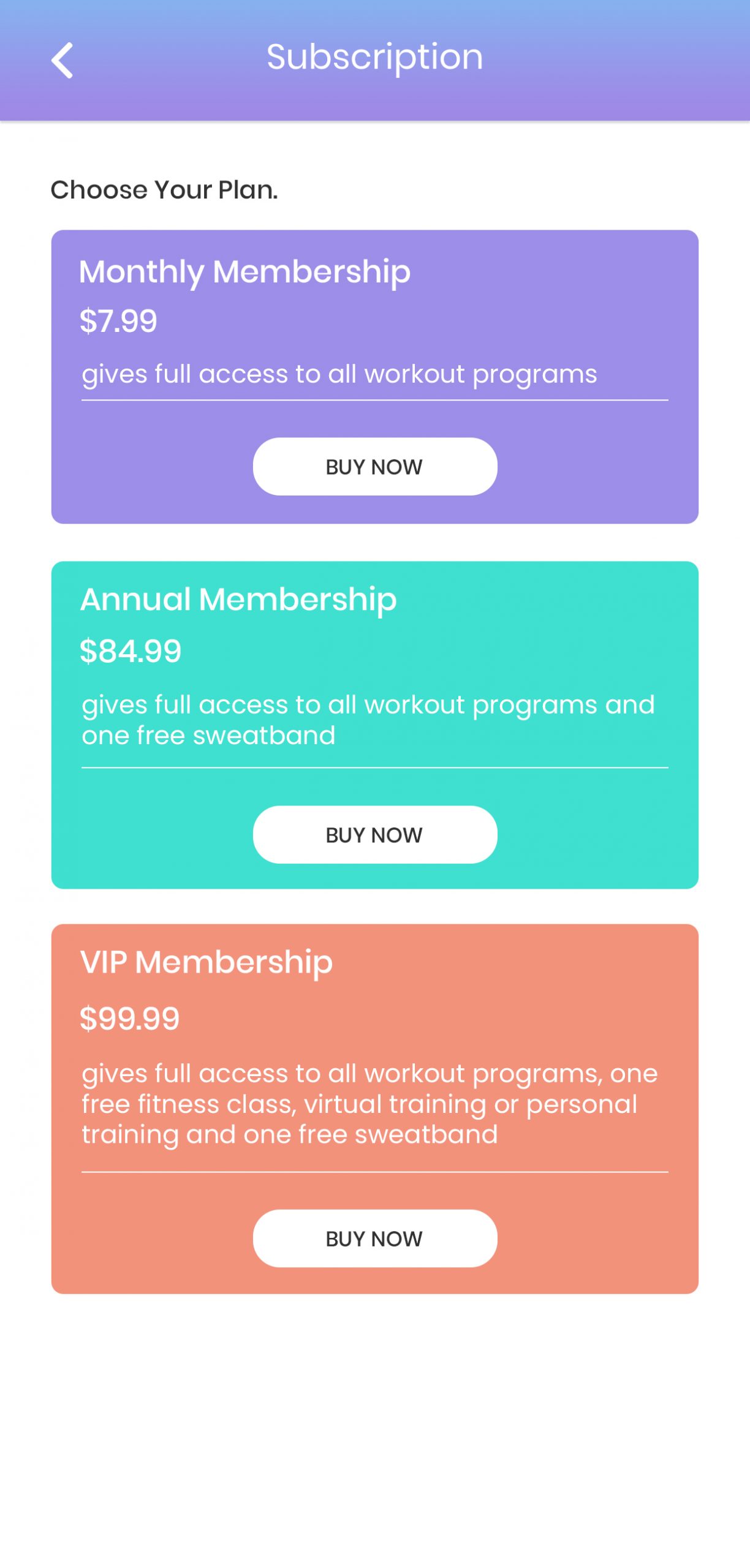
(Image: Account setting screen and Subscription screen from the app)
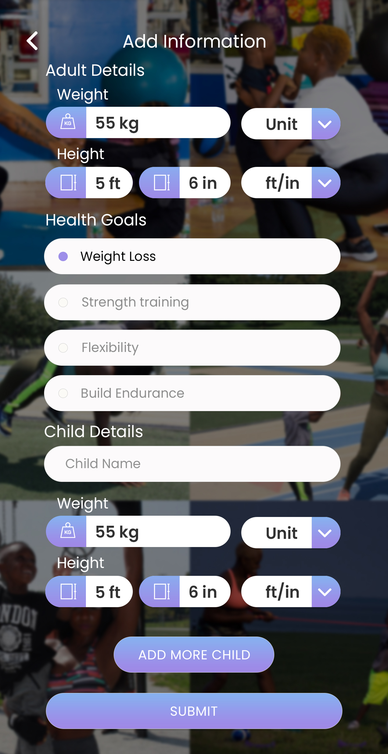
Not to mention, they can work out and focus on different goal-based options available in the app like – Weightloss, Strength-based training, Yoga Training etc., and add information accordingly.
Our Approach
The mobile app was divided into 4 respective phases to meet the client’s requirements.
Phase 1:
Scoping and Requirements (platform, screen sizes, features)
Our developers drafted the scope documents with the help of extensive research based on user behavior when it comes to using fitness apps similar to ours. We targeted the problem areas to determine users’ biggest frustrations in other such apps along with their interest & interaction for the same.
In addition to this, the doc contained the client’s requirements like app features, user access, screen sizes, etc., in detail.
Phase 2:
Design (wireframes, UI, engagement, visuals)
The second phase consisted of tasks like wireframing and visual crafting. UI and UX both were kept in deep focus by our developers while working on this phase, especially for app visuals.
Phase 3:
Development & Testing (android & iOS app, backend, tech-structure, integration, manual testing, user testing)
The app was developed for both iOS and Android platforms. Since it targeted two different user bases, we emphasized more on the functionality and tech structure of the app and tested it with each modification we made.
Phase 4:
Beta Testing & Deployment
Our team made sure that the prototype passed all the testing to detect bugs and performance issues. We followed the criteria of testing it developer-basis (technically) and user-basis (usability and UI/UX) to make sure all the requirements are met without any error.
Take Away
The mobile app is successfully helping our clients in expanding their userbase while adding to their revenue. We absolutely loved building such a valued product that is influencing and contributing to people’s health in such a big way!


