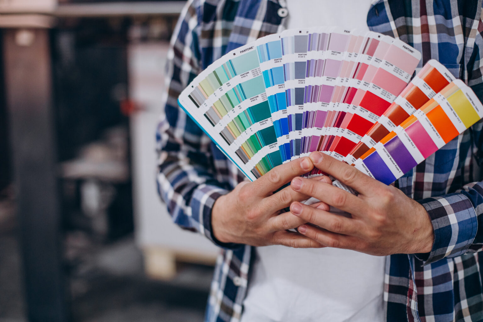
When asked what one’s favorite color is, an easy answer comes to mind. However, if asked why they’d picked that specific color, the answer becomes difficult to answer. This is because the color choice is not really defined by rationale. Choice, though arbitrary, has a lasting impact.
People tend to underestimate the impact that color can have on product development. Consumers relate color to the product as it appeals to the primary sense of sight. These reasons make color an important factor to consider when designing and developing a product.
Consumers decide their preferences according to price ad function, but the product’s appearance is another key point that they take into consideration when faced with a situation of comparison. So how can you use color theory to your benefit while product development? This is your guide.
How to Spice Up Your Product With Colors (Or Without Colors)
1. Initial Phase: Grayscale!
There are thousands, if not millions, of colors and their different tones. Designers make a mistake in giving in to the temptation of starting with color, but it can prove to be very overwhelming owing to the large number of choices at their dispense.
Starting with grayscale is the best way to go, as it helps you prioritize the solid hierarchy of visuals instead of getting confused by the infinite number of color and their combinations.
2. Consider Visual Weight
Visual weight, simply put, is the innate property of an object that attracts the attention of an individual. This makes visual weight a strong determining factor in the success of a design/product. A design or product will harbor more attention if the visual weight is more. So, how can you work on the visual weight of your product? There are three factors that make up visual weight;
- Size (the bigger the size, the more visual weight they have)
- Negative Space (more whitespace may lead to more visual weight)
- Color (a combination of contrasting colors may increase visual weight)
It is important that you have a clear sight of what exactly you want your consumers to notice first. Once you have a concise idea, move ahead and increase the visual weight of that. For instance, your call-to-action buttons can be made with more visual weight.
3. Know your Audience
It is vital that you know your market and audience well. Color preferences don’t really follow any set rationale, but they do have some factors that weigh into the selection. Factors like gender, age, and expression are among the many that determine color preferences. While you cannot cater to individuals, it helps if you know your target audience well and create user personas accordingly.
4. Follow Brand Colors
When working on a product design for an established brand, it is of great importance that you use the existing brand colors. The creation of a new color palette can cause dissonance in the layouts. However, if you are looking to define your brand colors, thinking out of the box and selecting unusual color combinations that are aesthetically pleasing and in line with your brand may be the best way to go. These things make the brand and product memorable to the customers.
In recent times, brands have opted for fresher and brighter colors to draw attention with immediacy.
5. Balance is Key
Bright and unusual color combinations are the way to go. However, it is easy to go overboard with the use and make it off-putting. Improper use of colors may be extremely unsettling to consumers. It may distract them. Achieving harmony of design is necessary, which makes the balance of colors key.
A few pointers to keep in mind to avoid this mistake are as follows;
- Follow the 60-30-10 rule. To elaborate, while creating a new design, 60% of the color palette should be different tones of one single color. It helps if that color is neutral. 30% should be a complementary color, while the third color should be used as an accent and make up for 10% of the design.
- Try to stick to a maximum of three colors. More than three can make your design seem cluttered. However, if you require more colors, it is best to stick to the tones of the existing ones. Darker colors and lighter tones may help in this.
- When in doubt, use palate generators. They will help you find color schemes that are well-balanced. Take the Color Cue
6. Take the Color Cue
It is a misconception that color has a mere decorative purpose. Ideally, it should serve a functional purpose as well. Color is used for the simplification of consumer interaction with the particular product. Users rely heavily on colors when interacting digitally.
Color makes it possible to highlight interactive objects from the static ones. They also can be used to mark the status of features (available/unavailable). It also helps in centering the user’s attention to what’s important. Be consistent with your use of color.
In Conclusion
There are several aspects to your digital presence and it can be a little daunting. Getting all details right is necessary for your business to thrive. And that is what we do at Saffron Tech. Get your business up and running with our arsenal of industry experts manning all aspects of your launch to success. Reach out to us today for all digital needs and data-driven solutions!
Subscribe to Saffron Tech
Explore your marketing zen with our newsletter! Subscribe now.


